Why [Party] will win the next general election
Five scenarios of varying plausibility
Predicting the future is a mug’s game. With the pundits still debating the impact of yesterday’s Budget, why do we think we can say what’s going to happen in the next 3-4 years?
Particularly when the polls have moved as dramatically - and in such an unpredicted way - as they have in just 18 months, why do we think that the next 18 months will be any less surprising?
The truth is that we can’t be sure. And yet I still hear people on the right saying that Labour is a busted flush - or, conversely, people on the left saying that Reform can’t possibly win. It’s all too easy to tell ourselves just-so stories that sound eminently plausible - particularly if they’re what we want to hear.1
Scenarios are one way in which we can overcome this: instead of telling ourselves one just-so story, we look at several. These help us to think through what’s true, what might be true - and what would be needed to bring each one about. So in today’s piece I’ll set out five scenarios: one for how each major party wins the next general election.2
But first, some grounding
In a piece I wrote immediately after the 2024 exit poll landed, I suggested that one outcome, a further splintering of support away from both Labour and the Conservatives, was underpriced.
That prediction has stood up pretty well - though I underestimated both the speed and the scale of that splintering. Similarly, the scenario in last September’s effort to look ahead to the 2029 General Election that is by far the closest to the current situation is ‘The Centre Cannot Hold’ - though even there, I had Labour and Conservative on 25% and 22.5%, rather than their current 18% and 17%.
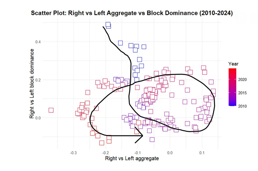
In that, I used a simple fragmentation model to look at scenarios. Since then, James Kanagasooriam has come up with a better and more complex model,3 which involves considering both the size of the Right and Left blocs, and the extent to which one party manages to unite its bloc. He argues that this causes politics to move in cycles, not just in terms of the standard thermostatic effect between left and right, but due to one party managing to unite their bloc when the country collectively decides that it’s time for a change.
In five party politics, what’s up for grabs is not just the size of the right and left, but which party - if any - manages to dominate its side.
What do we know and what can we guess?
How can we think about what might happen? Looking at polls, recent elections, underlying trends in attitudes and what’s happening in the real world can help us get a handle on what might affect the fate of different parties.
Polls
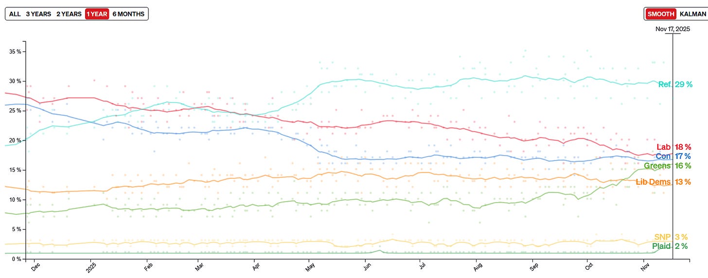
We know the polls are volatile and have changed rapidly since the general election. We can be confident that Reform are in front, with a lead of approximately 10%4 and that no other party is above 20%. It is likely that Labour are still a little ahead of the Tories and that the Greens are rising rapidly since Polanski became leader.
We also know there is a chunk of ‘Don’t Know’s - c. 15%, according to More in Common. Ben Ansell’s work suggests that these look more like Labour or Lib Dem voters than they do any of the other parties, though there is not a perfect overlap.
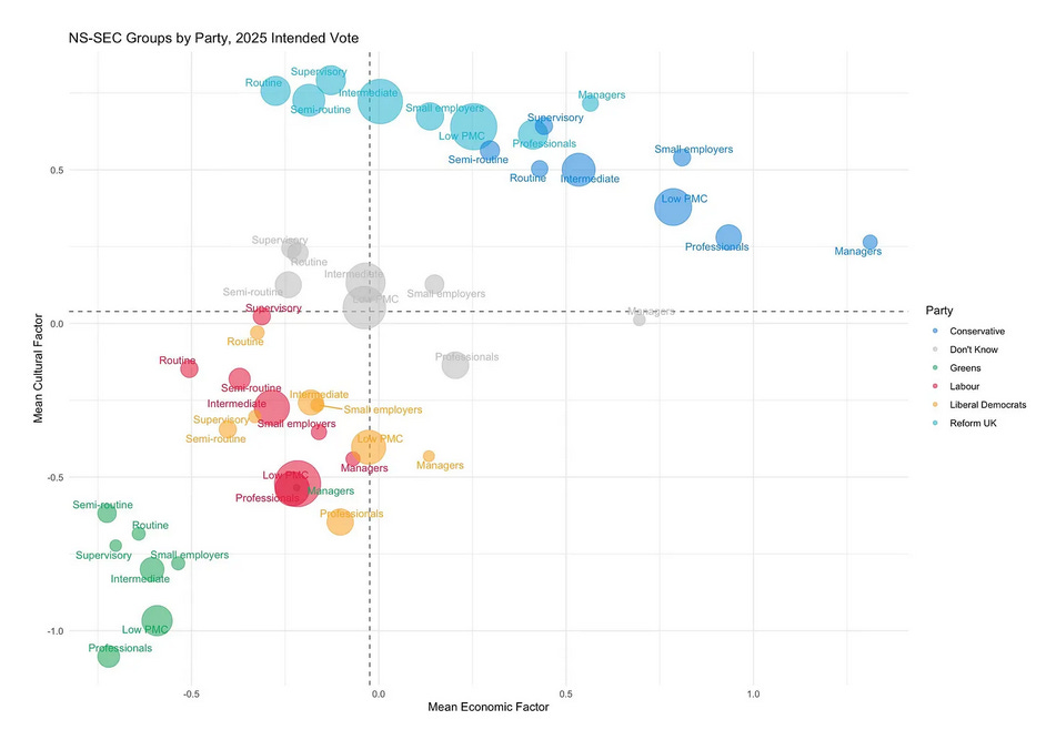
Polling suggests there’s a fair degree of willingness to tactical vote within blocs.5 And indeed, in the recent by-election in Caerphilly, we saw voters rallying round Plaid Cymru to defeat Reform, with Labour reduced to 11% and the Tories nowhere.
Council elections
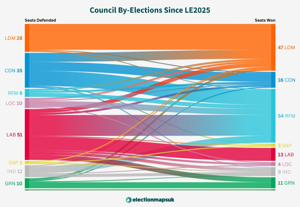
We also have council elections to look at. At the latest local elections, Reform won big, with the Lib Dems also doing well:
Reform and the Lib Dems have continued this dominance in local by-elections since May, between them winning two-thirds of the seats available.
Local elections don’t tell you everything: turnout is much lower, and some people will vote differently in a local and national election. But they do tell us something - and, in addition, having a large number of local councillors provides an army of foot-soldiers to deliver leaflets and knock on doors.
Thermostatic Effects
It is probable that thermostatic effects - the fact that when a left-wing government is in power people’s opinions tend to move right, and vice-versa - will apply. These aren’t universal, and they don’t always result in shifts between parties: sometimes the party in power shifts its position to adjust (for example, Labour cutting immigration). But it is likely. Since the election, we’ve seen the left/right blocs go from 53/38 to essentially tied on 47/46 - and there are still over three years to go.
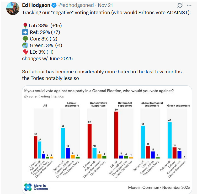
In polling that asks which party people would vote against, we’re also seeing Labour becoming more unpopular - and has now overtaken Reform as the party who most people would vote against.
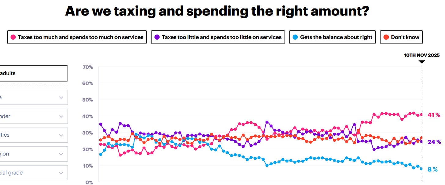
We’re also seeing public opinion shift on the core question of tax and spend. YouGov’s tracker shows a steady increase in the proportion of people who think we are taxing and spending too much, with this now beating out the opposite by 17 points.
Again, it is likely that the £26 billion of tax increases announced in this week’s Budget will shift the balance further.
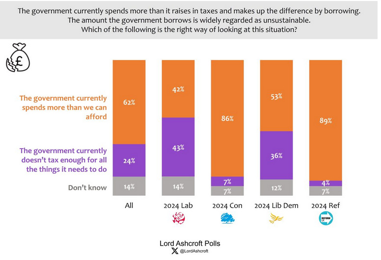
Other polling on this issue tells a similar story:
The underlying reality
The economic situation remains bleak. Latest documents from the OBR show that this year we will be borrowing £138 billion, with debt forecast to rise to 96.8% of GDP by 2029-30. This is despite £66 billion pounds of tax rises since the general election, to take tax receipts to an all-time high of 38.3% of GDP.
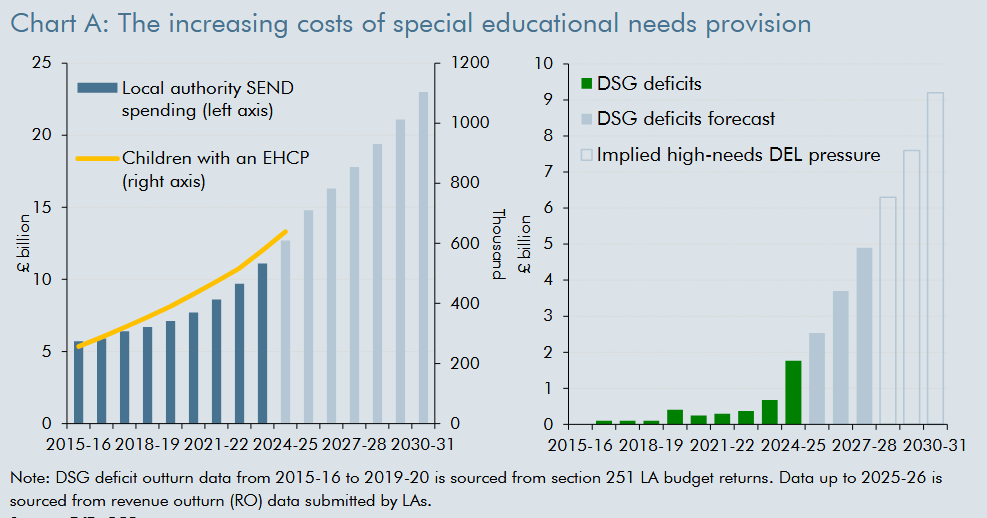
Net household incomes are forecast to rise in real terms at just 0.5% a year. Growth has been revised down for future years; inflation revised up, with the OBR saying it will stay higher for longer. The unemployment rate has hit 5%. 6.5 million are on out-of-work benefits, a large number of whom have no requirement to look for work. Spending on welfare and pensions is forecast to increase by £73 billion over the next five years, to a total of £406 billion. House building has slowed to its lowest level in nine years, and many individual budget lines are on an unsustainable trajectory:
Despite this, no-one thinks public services are in a good shape, and the broader decay of the public realm - potholes, library closures, etc. - continues.6
Although there are many places savings could be made, there are few of any size that would not prompt a political outcry - and u-turns over the Winter Fuel Allowance and on welfare suggest the current Government has limited ability to push such through.
Immigration is falling significantly, while small boat crossings in the Channel are up compared to last year. Serious crime is down, but public disorder and ‘street crime’ - shop-lifting, phone-thefts and the like, is up.
Internationally, the global environment remains febrile. Trump is in the Whitehouse, there’s a land war in Europe, the Middle East is unstable.7 It may be that there will be unexpected good news - but the ending of the Pax Americana and transition to a multipolar world is one in which instability and unpleasant surprises are more probable than the converse.
Are we at the scenarios yet?
Yes!
We’ll take each in turn, in reverse order of the party positions in the poll of polls - and follow each with a short riposte.
“Why the Liberal Democrats will win the next general election”
Of all the parties outside the ‘main two’, only the Lib Dems have both a significant number of MPs and a sustained track record of winning in the local elections. Look at that by-election chart: doesn’t that look a lot like two-party politics, with the Lib Dems as the main rival to Reform? Support for the Greens is theoretical - but the Lib Dems are proving the strength of their support at the ballot box.
Labour’s unpopularity will only increase. And while the Greens may be capitalising on that for now, they have a hard upper limit. Once they come under scrutiny, people will realise they’re not the safe feel-good party that is often assumed. Their hard-left policies on tax and billionaires will alienate the middle classes, while their anti-NATO, anti-nuclear policies will do them in amongst ‘red wall’ types. In contrast, the Lib Dems stand for the sensible, socially liberal centre ground on economics and culture which is where elections are won.
The Lib Dems may not be many people’s first choice - but they’re many people’s second. That’s enough to propel them to victory, if the alternative is Nigel Farage’s Reform party.
Riposte: Local elections are not general elections. The Lib Dems have already maxed out: they may have 72 seats, but they’re second in only 27. Their vote share hasn’t increased even as both Conservative and Labour support has plummeted - why should that be any different in the future?
“Why the Greens will win the next general election”
Charisma is underrated in politics - but it matters, and Zack Polanski has it - the only party leader who can compete with Farage. From Mamdani to Trump, we’ve seen leaders with charisma overturn conventional politics - and the UK will be no different.
He’s taken the Greens from 10 points to 16 points in the polls in just a couple of months and party membership is soaring. With Labour’s popularity tumbling, there’s a space for an authentic party on the left - and the Greens are the only party that can fill that gap. Whether on climate change, poverty or human rights, people are looking for a party which will stand up for its convictions - and isn’t afraid to take on the billionaires and corporations who are holding the country back.
If we look at the previous success of Jeremy Corbyn, is it really implausible to think that the Greens under Polanski can get to 30 or 35 points? And at the next election, if it’s a straight choice between Green and Reform, the people will choose love, not hate.
Riposte: There’s a hard cap on what the hard left can achieve. People may be vote Green as a protest, or to show they care about the environment - but wait till their policies come under scrutiny. The voters of North Herefordshire and the shires will never risk a party with such radical views on tax, energy and defence in government.
“Why the Conservatives will win the next general election”
Although the Conservatives may have made a slow start, over the last 18 months, Kemi Badenoch has quietly ended the big divisions in policy - on the ECHR, on ‘woke’ and on Net Zero - that deadlocked the last Conservative government. More people would now vote against Reform or Labour than against them - and they still have the second highest number of seats in Parliament.
The agenda is now turning back to classic tax and spend - ground that favours the Conservatives over Reform. With immigration falling to below 200,000 weakening the salience of their best issue, and facing ever greater scrutiny, Reform fall back to 25 points, while the Tories gain. ‘Values’ voters who turned to Labour or the Lib Dems baulk at Reeves’s ever-increasing tax rises - and when Starmer falls, and is replaced by a left-wing rival, the Tories look ever more attractive.
By 2027, the economy is once again the foremost issue for voters - and whether under Badenoch or under a new leader, the Conservatives are best-placed to ride it to victory.
Riposte: Fourteen years of failure can’t be forgiven so quickly. The Tories are 7 points below where they were at the last election; the left hate them - and why would anyone on the right vote for them, when they can have the real thing in Reform?
“Why Labour will win the next general election”
This week’s Budget stabilises things for Starmer and Reeves. With their backbenchers satisfied they continue, despite bad local election results in May. The economy’s not great, but there are no disasters - and though most people continue to feel as if they’re struggling, some core constituencies, particularly public sector workers and those on benefits, begin to feel they’re better off.
This isn’t enough to move the polls, however, and in 2027, after a fourth disastrous set of local elections, Starmer steps down. The party elects a new leader from the left - perhaps Angela Rayner - who denounces Blue Labourism and pledges an ‘authentic government of the left’. Voters who’ve left for the Greens and the Lib Dems - or to the pool of ‘don’t knows’ - are drawn back, wondering if this might be the Labour Government they’d hoped for.
Declaring she wants her own mandate she goes to the polls, making the most of her honeymoon period - and before the reality of difficult decisions has had time to bite. Faced with the prospect of a Reform Government, the voters hesitate, with the right split evenly between Conservatives and Reform - and Labour narrowly scrape home.
Riposte: An election after changing leader may have worked for Boris, but only due to Brexit - as Truss and Sunak would tell you, it’s no panacea. Labour’s unpopularity is at the level where it doesn’t recover - and there are only more hard decisions ahead.
“Why Reform will win the next general election”
Let’s not play 4D chess: Reform is ten points ahead in the polls and if a general election was called tomorrow, they’d likely win. The country’s broken - and as the Government continues to fail to stop the boats, improve living standards or noticeably improve public services, more and more people will turn to Reform. Once people have voted Reform once, they’re likely to do so again - and just as there was a big bump after the last local elections, there’ll be another after the next.
Those hoping for a coalition of the left to stop them are deluding themselves. Labour’s already significantly more unpopular than Reform and that will only worsen. Good luck getting people to tactically vote for Labour to keep out Reform - it’ll increasingly be the other way round. Wales and Scotland may be tricky, but in England there just aren’t enough seats that the Lib Dems and Greens can realistically contest.
With the left split three ways, and Reform dominating the right bloc, they can’t help but win - and even if they don’t achieve an absolute majority, the Tories will prop them up in coalition, or through a confidence and supply arrangement.
Riposte: Reform has a hard limit of support at 30% - it may even have peaked. It’s overly dependent on Nigel Farage and its policies won’t stand up to proper scrutiny. People may flirt with Reform - but as we saw in Caerphilly, when push comes to shove, the majority will vote for whoever they need to to keep them out of power.
Cards on the table: so what’s going to happen?
There’s always a great deal of uncertainty - and particularly now. I wouldn’t give any party a better than even chance of winning the next election. Reform is clearly out ahead now - but Labour have more pathways to victory: more people who’ll vote for them tactically, more potential coalition partners and, being in Government, more opportunity to make the weather - and to determine the timing of the next election.
But if you want my very rough estimates, I’d give the probability that their leader will end up Prime Minister after the next election as Reform: 40%; Labour: 30%; Conservatives: 15%; Greens 10%; Lib Dems 5%.8
Time will tell!
Or perhaps if they are what we afraid is true.
I am using ‘win’ in the broad sense here to mean ‘Party leader becomes Prime Minister’. It could be at the head of a minority government or a coalition, as well as with an absolute majority.
Anyone would think he’s a professional pollster, or something.
Though could easily be anything from 6% (28 vs 22) to 14% (32 vs 18)
Though it is an open question the extent to which people will be willing to tactically vote for Labour after 5 years of incumbency.
For a further discussion of this, see the section on the hollowing out of local authority budgets, here.
Though when is it not?
Sorry, Lib Dems!



Oh no what depressing conclusions…But interesting to read your thought processes behind them. Feels like we’ve got quite a bit more instability and dumb politics to get through yet
For these scenarios, are you assuming that the next GE happens in early to mid 2029?
Personally, I don't believe that's a reasonable assumption.
Also, turnout was down by quite the chunk - 7ppt? - in 2024. What would cause those voters (or more) to suddenly re-appear, and where would they go? Or, the reverse, another fall in turnout? That'd be, interesting.
Further, external shocks. More than a couple of things could suddenly go hot. Or internal, for that matter.