
The Fallacy of the 'Average'
It doesn't matter to most policy debates what the return is on the 'average' graduate or immigrant. What matters is the marginal return.

Averages are great things. When mathematical functions get together to brag about who’s the best, the mean and even the median are strong contenders for the crown.1
But sometimes a focus on the average is misleading. In particular, if you’re thinking about whether you want more or less of something, you’ll usually be better off thinking about the benefit/cost at the margin, rather than the average - because if you focus on the average, you’ll go on increasing production well past the point where it is costing you money.
Two important areas of public policy where the average benefit is often taken in vain are university graduates, and immigration - both of which we’ll be looking at today.
So what’s this marginal benefit/cost, when it’s at home?
Before plunging into the politics, let’s look at what we mean by the marginal vs average benefit using an example without any political salience: a factory making widgets.2
We’ll use a very simple economic model:
There are fixed costs of £5,000 a week to operate the factory.
Making 0 to 100 widgets, each widget costs £100 to make.
Above 100 widgets, costs increase - perhaps because the machines need more maintenance, or the workers get overtime. The cost for each additional widget increases by £3 for every widget over 100, until it plateaus at £1000 at the 400th widget.
Every widget can be sold for £500.3
Plugging this into a spreadsheet, we get the following graph:
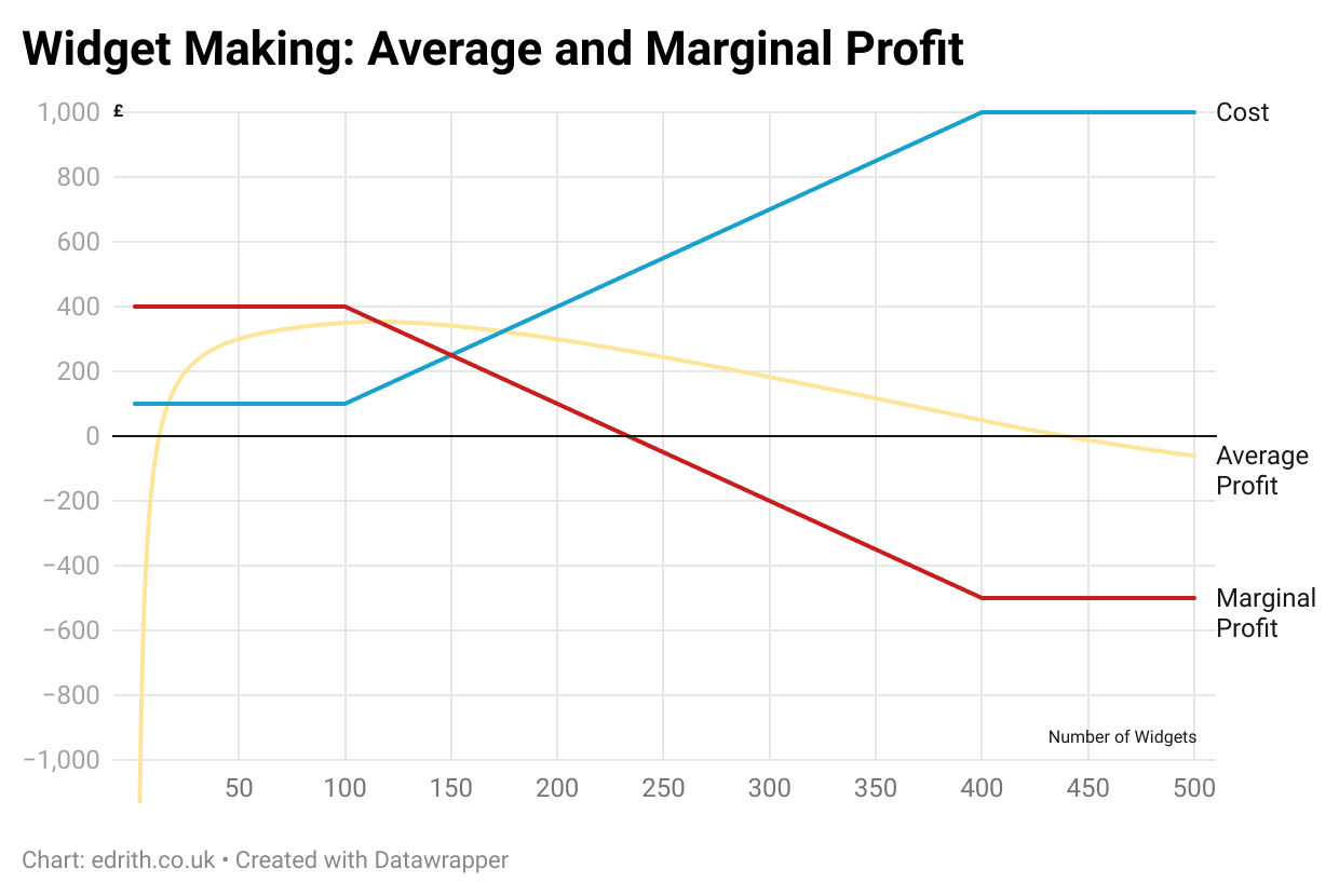
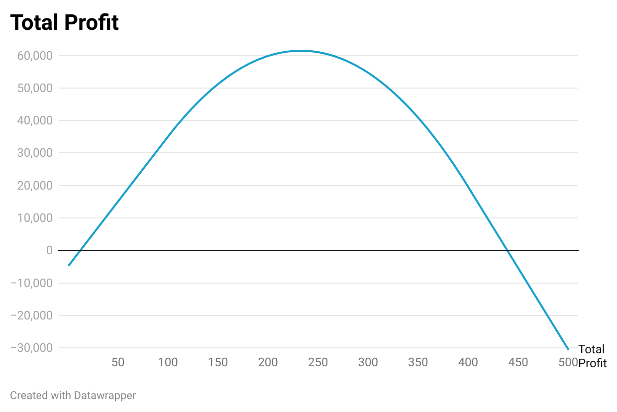
We can see that average profit peaks at 115 widgets (£353 per widget). However, assuming the factory owner wishes to maximise profit, it is still worth making more widgets up to 233 widgets, where total profit maxes out at just over £61,000.
Note that at this point, where the marginal profit goes negative, the average profit is still positive - but the factory will still lose money with every additional widget produced.
Imagine the factory is running at a steady state, producing 300 widgets a week, making a healthy weekly profit of £54,700. That seems pretty good, but Owner Oliver wants to know if he’s wringing every last inch of profit out of his capitalist enterprise.
He goes to consult Manager Matthew, who says to him, ‘Yes boss, look, average profit is still £182 per widget. In fact, if you let me run another overtime shift, I could make you even more money!’
Sounds good, but Owner Oliver is no fool and wants a second opinion. He goes to Accountant Annie, who gets out her spreadsheets and says, ‘The average profit may be in the black, but each new widget is costing us £700 - that’s a £200 loss on every widget. If you run the extra overtime shift, we’ll lose even more money. It’s counter-intuitive, I know, but to maximise profits you should cut back production, stop running the machines red hot, and only produce 233 widgets a week - and then you’ll boot your profits to £61,467.’4
The fallacy of the ‘average’: Higher Education
In the debate over whether too many people are going to university, defenders of expansion frequently cite the (true) facts that the average graduate earns more, or is more likely to be employed than the average non-graduate; or that the graduate premium over the course of a lifetime - after taking into account prior attainment, student loans and higher taxes - stands at over £100,000.
However, in considering whether too many people are going to university, we are not interested in the average, but the marginal case. Would we be better off if one more - or one fewer - person went to university? And here it is a very different story.
The gold standard study from the IfS, which takes into account prior attainment and demographic factors, shows that fully 20% of those who go to university are no better off, or even worse off, over their lifetime than if they had never gone.
This, in fact, is likely to be an under-estimate of how many people we are unnecessarily sending to university, for two reasons:
The study was done based on graduates who entered university over 15 years ago, at a time when the proportion going to university was 10 percentage points lower and the graduate premium higher. It is therefore likely that the proportion seeing no benefit is now higher.
The ‘signalling’ effect means that even if a degree isn’t needed for a job - in fact, even if it imparted no skills at all5 - an employer can use it as a selection tool, as proof that someone has a certain ability to stick at something for three years. We can see this happening in the way many jobs that used to not require degrees now do, or how a graduate may be preferentially selected for a job that doesn’t require it, such as a teaching assistant. In this way, graduates may still earn more than non-graduates, even if their degrees are not actually needed. The fact that a a third of graduates are in non-graduate jobs strongly suggests we are in this situation, over-supplying graduates well beyond what the economy needs.
This is rational for the employers, and rational for those individuals to go to university, but overall the system is worse than one where fewer people go: the marginal individuals get the same job they would have done, but now have student debt, and the taxpayer has to pick up the part of the loan that isn’t paid back.6
So the figure of 20% can be considered to be a lower bound of the over-supply of university places, with a figure of 30% - 40% being a more likely estimate.7
The sector lobbyists at Universities UK and others who argue for expansion are thus like Manager Matthew above: gesturing furiously at the average return, not noticing that the marginal benefit became negative some time ago.
Now, the sharp-eyed will have noticed a major difference with our previous examples: unlike widgets, graduates are not fungible: different graduates will have a wide range of skills and abilities. In addition, rather than varying the cost of production (most universities charge approximately the same), we are varying the return from the degree: some graduates get a large return (as does the nation, through their higher productivity, higher earnings and higher taxes) and others do not.
This could, in theory, provide a lifeline for those who support expansion. If, when we increase or decrease the number of people going to university we have no control over the calibre of the graduate produced - if, in effect, we are plucking/canning a graduate at random from the probability distribution - then the average would be the relevant figure to consider.
But a moment’s thought tells us this isn’t the case. We have excellent data on which subjects and which universities are worthwhile - and which are not. We also know that prior attainment is a strong predictor of both performance at university and subsequent success. 8 While we cannot select perfectly, this gives us powerful tools to reduce places in a way that preferentially targets those that are providing a negative return, while keeping those that are of value. In particular:
We could reduce the number of funded places. As universities primarily select on ability, reducing the number of places available will disproportionately remove those with least ability to benefit from an academic education,9 This is the simplest, and arguably the best option, as it most respects university autonomy.
We could preferentially reduced the number of funded places in subjects where there is strong evidence of poor returns, or that we are training far more people than the graduate labour market requires.10
We could shut down courses with high drop out rates or low progression to graduate employment.
We could impose a minimum entry requirement - based on either A-Level grades or equivalent, or via a standardised test such as the US SAT.11
We could convert many of the weaker universities back to being Polytechnics / Technical Universities, or merge them with Further Education colleges, refocusing them upon vocational courses that train people for jobs required in their region.
We could introduce a much more rigorous inspection regime (a la Ofsted), shutting down poor quality courses and taking tougher action against universities in ‘special measures.’
The average return on university12 is as irrelevant to the question of whether too many people are going as the average profit per widget is to whether Owner Oliver was producing too many widgets. Targeted policies can reduce the number going until such time as the marginal return becomes positive once more.
Immigration
As with higher education, so with immigration.
The Manager Matthews of this world love to tell us that the average immigrant has a net positive impact on the economy. And the ONS’s analysis suggests that they are right. Even where individuals acknowledge that there are other factors (cultural, integration…) at play, they tend to present this as a trade-off, as in Ben Ansell’s recent piece: “There are tradeoffs in people’s preferences. Some people really do value lower immigration in ways that don’t correspond to its economics benefits or costs.”
But as Annie Accountant would remind us, we’re not interested in the average benefit, but in the marginal benefit. And a quick glance at the graph below from the ONS will show us that there are plenty of ways to reduce immigration that don’t involve significant economic trade-offs.
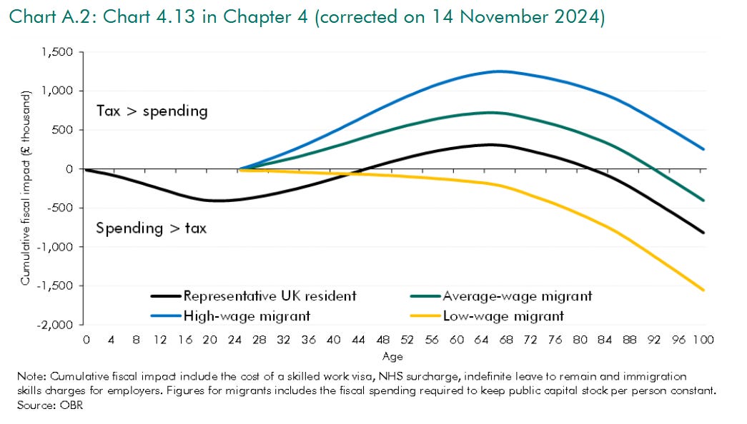
If we take the graph above as an accurate representation of the net benefits,13 it shows that even if the average immigrant has a positive economic benefit, low-waged migrants do not. Provided we devise our immigration policy to prioritise the highest-contributing migrants - to be the ‘grammar school of the Western World’, as Neil O'Brien would say - then the marginal benefit (currently negative) is what’s relevant, not the average.14
Of course, like graduates - and unlike widgets - immigrants are not fungible. They will have differing education, skills, employability, requirements, ability to speak English, ability (and willingness) to integrate, capital, values and more.
So the question is, do we think that we are essentially plucking immigrants at random from an amorphous pool, in which case the average would matter most? Or do we think we should - if we chose to use it - have a high ability to control who comes, so that we can differentially stop opening our borders to those who do not have a negative economic benefit?15
The answer, clearly is the latter. Potential policies that would preferentially target the negative margin include:
Deporting serious criminals. There are over 10,000 foreign criminals in UK prisons. Automatically deporting these individuals, either immediately or at the end of their sentence,16 would be of clear benefit to the UK. While 10,000 people may not be enough to move the economic statistics, removing 1/8 of our more serious criminals instead of releasing them back to the streets would make a noticeable dent in the crime rate.
Raising the salary thresholds to gain a work visa.
Making it harder for immigrants - in some or all categories - to bring over dependents.
Requiring higher requirements for speaking English, or higher educational requirements.
Removing or restricting routes where salaries are lower - the median income for those on the graduate route, for example, is just £21,000. It could be removed, or restricted to those at high quality universities.
Restricting visas from certain countries, based on a statistical analysis of earnings, benefit claims and crimes committed by recent migrants from those countries.
Preventing immigrants from claiming Indefinite Leave to Remain - or, ultimately, citizenship - unless they are earning a certain salary threshold, or if they have claimed out-of-work benefits during the period of their stay.
Stopping the Boats(TM).
Making it harder for people to claim asylum from other visas, such as the student visa route.17
Almost all of these policies have both benefits and disadvantages.18 You may disagree with some of them; you will certainly consider that some of them are better than others. But all of them would clearly reduce immigration by primarily targeting the marginal, which is net economically negative, therefore driving up both the average, and the total, benefit.
Of course, it is not possible to do this indefinitely. At some point, the marginal immigrant will be net economically positive19 - and at that point there would be a genuine trade-off between lower immigration.20 But we are not currently at that point.
So, average benefit or marginal benefit? From widget-manufacturing to higher education to immigration, provided one has a degree of a control over the system, the marginal benefit is a much better indicator of whether one is currently producing too many or too few.
Whether in higher education or migration policy, those who use the average to urge for ever higher numbers are like Manager Matthew, asking the boss for another overtime shift even while they’re losing money on every additional unit. Better to be like Annie Accountant - and recognise that when the marginal benefit is negative, it’s past time to scale back.
The mode, however, continues to usually suck.
If you are someone who can only enjoy reading about economic policy if it has culture-war vibes, feel free to imagine it is a WOKE or FASCIST factory, producing cluster munitions, puberty blockers, Teslas or COVID-19 vaccines, as you see fit.
The factory is too small for its production to impact overall market prices.
For anyone still doubtful that profit peaks at the point the marginal profit per widget goes to zero, the graph below shows this more clearly.
I’m not saying degrees do impart no skills, simply that the economics holds even if that is the case.
This is a good example of where the incentives on individuals produce a negative sum game - and, without action by government to limit the number of places to what is really necessary, leaves everyone worse off.
Yes, university also has a role of making friends, maturing, intellectual inquiry, socialising and ‘finding yourself.’ This is why people who don’t go to university famously have no friends and are perpetually immature.
Obviously the previous sentence is untrue: friendships, relationships, curiosity and maturation can occur in many settings (some, in fact, perhaps even more so than at university). Around a third of university students live at home, anyway, often working part-time, and have far from the ‘classic’ university experience. Ask yourself this: if it didn’t already exist, would you really establish a system where 18 year olds got into £50k of debt (or the taxpayer picked up the whole tab) to spend three years doing something that would not help them get a better job, purely for these ‘wider benefits’?
A recent report has suggested that the falling graduate premium may be driven in part by the addition of large numbers of graduates with low prior academic achievement, who would not previously have gone to university and (on average) gain little or no benefit from doing so.
This does not mean these people are somehow ‘worth less’ as individuals, or as citizens. Many would be able to benefit more from other forms of education, such as apprenticeships, or vocational education - and even if they do not, a person’s worth is not reflected by their economic contribution. But this does not mean we should spend £50,000+ pushing people who have not demonstrated their ability to perform at a suitable academic level through a higher education course.
Business studies, law, many social science subjects and creative arts being obvious candidates.
This would not need to be a ‘fail once and that’s it’. Those who did not do well at 18 could qualify later, either by retaking A-Levels or taking alternative entry courses.
In which we should think about the cost and the return to both the individual and the taxpayer.
There are some reasons to think the ONS chart may modestly over-estimate the benefits:
It does not take into account upwards pressure in house-prices.
It assumes that immigrants have the same number of dependents as UK citizens - and assumes no educational spending, by assuming all arrive at 25. If immigrants have more dependents, including ones who use education, this will shift the lines down.
It assumes no welfare spending for the first five years as most migrants have ‘no recourse to public funds’. There are two problems with this:
‘No recourse to public funds’ is an misleading term: someone with this status can get benefits including statutory maternity and sick pay, or free school meals.
Over 110,000 people claimed asylum last year - and, as we know, such individuals get a variety of benefits, including accommodation, taxis, dental care and a (small) weekly allowance.
Though one should never underestimate the ability of the UK Government to commit self-harm on its migration policy.
Of course, some people value higher immigration for reasons that have nothing to do with the economic impact. Perhaps they value living in a more diverse and multicultural society, or they think we should be more generous to refugees who are fleeing hardship. There may also be others (such as myself) who do not want higher immigration in general, but think that we should make it easier in specific circumstances, such as allowing British citizens to bring over their spouse. But this piece is simply focusing on the economic side - and considering whether there is genuinely a trade-off between lower immigration and the economy.
There are two main schools of thought here. The steelman for the first is that our prisons our full, keeping foreign nationals in prison here means more prisoners released early on the street and a higher burden on the taxpayer - so why do it? The steelman for the second is that deportation isn’t sufficient punishment: for example, many people felt it was unjust when the US woman who claimed diplomatic immunity after killing the motorcyclist Harry Dunn was able to return to the US without punishment. For the purposes of this piece, let’s just say that either would be an improvement over the status quo.
Last year 16,000 people claimed asylum after entering on a student visa.
Except for deporting the criminals.
Or, at least, there will be sufficiently few low-earning migrants that it’s not possible to effectively devise policies to differentially bar them without also barring too many higher-earners.
I am not sure exactly where that point would be, though I suspect it comes considerably before Reform’s current policy of ‘net zero’ immigration.
That ONS graph is one of the most disingenuous and deceiving graphs that keeps popping up; for an organisation of statisticians it's completely brain dead. It only compares migrants that get a job against all British born natives (including those who may never get a job). When we've seen from the Boriswave a significant number of dependents being brought through on immigration visas this graph is at best not serious and at worst deceptive. What a terrible comparison for the ONS to make.
Thank you. A lot of people seem not to understand this. Your post will be a good resource to link to in that situation.