
Geography is not Destiny
Small countries can - but don't always - economically outperform their larger neighbours

“A small nation on the periphery of a regional hegemon faces a distinct economic disadvantage. Shut out from the benefits of a larger market, forced to obey the other’s rules without influence and with little control over its broader economic environment, it will inevitably lose ground to its larger neighbour.”
Or is it:
“A small nation on the periphery of a regional hegemon faces a distinct economic advantage. Nimbler and more agile, it can tailor its rules and regulations to suit its own needs, its currency reflects its own needs, not those of a vast geographical neighbour, meaning it can become a natural home for innovation and economic growth.”
Both sound plausible! And indeed, one often hears both arguments made1 depending on which country you are talking about - or which political commentator you are talking to.
So which is right? We’re going to look at eight examples of small countries2 next to a much larger and culturally similar neighbour to see what happens in practice:
Canada and the United States
New Zealand and Australia
Singapore and Malaysia
Taiwan, South Korea, North Korea and China
Ireland and the UK
Belgium and France
Ukraine, Belarus and Russia
Sri Lanka, Nepal and India
We’ll be using GDP per capita as a measure of wealth - we already know the larger country will have a larger GDP, so GDP per capita is what matters. All data is from World Bank Open Data. Unless there’s a good reason not to (which I’ll specify) we’re using data from 1960 (the first year in their database) to 2024.
All graphs are in current US dollars.
Canada and the United States
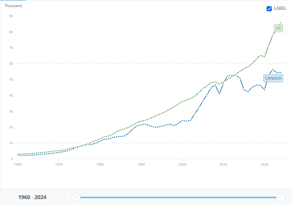
Average annual growth:
Canada: 5.1%
USA: 5.4%
The US begins richer, stays richer most of the way through, grows faster and ends up richer. Canada overtakes very briefly at the end of the noughties, due to a commodities boom and weathering the global financial crisis better3, but the USA soon pulls away again.
Result: Big country win.
New Zealand and Australia
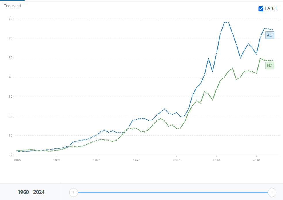
Average annual growth:
New Zealand: 4.9%
Australia: 5.7%
New Zealand began richer, but Australia overtook in the mid-60s and has been broadly pulling away ever since.
Result: Big country win.
Singapore and Malaysia
This chart begins in 1965, as that is when Singapore separated from Malaysia.
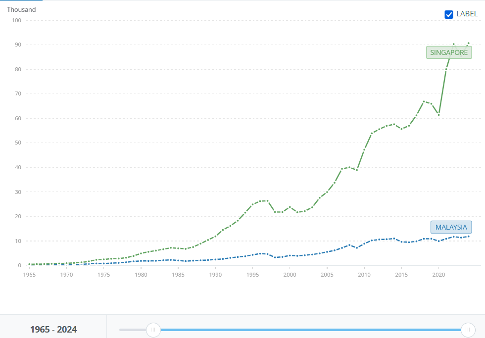
Average annual growth:
Singapore: 9.2%
Malaysia: 6.3%
Both Singapore and Malaysia started very poor, though Singapore was marginally richer. By 1975 it was three times richer and from there it continued to accelerate - barring the Asian financial crisis - today being one of the wealthiest countries on the planet. Malaysia is now a strongly growing middle-income country, but Singapore is in a league of its own.
Result: Small country win.
Taiwan, South Korea, North Korea and China
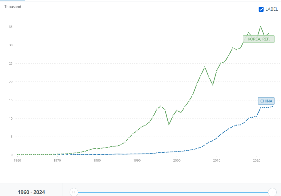
Average annual growth:
South Korea: 8.7%
China: 8.1%
This one’s a game of two halfs. South Korea started off a little under twice as rich as China, and now is a little under three times as rich, so seems like a clear winner. However, if we were to start the graph in 1978 - the beginning of Deng Xiaoping’s reforms - then over the last 46 years, China has grown at an average rate of 10.1%, vs South Korea’s 7.1%.
The sharp-eyed amongst you will spot that I promised North Korea and Taiwan in the heading, but didn’t deliver them in the chart, as they’re not in that data set.
Looking their figures up elsewhere - and with the caveat that they may not be perfectly comparable - we find that Taiwan follows a very similar trajectory to China, growing more over the whole period, but less in post 1978 period. North Korea is, obviously, a complete disaster zone.4#
Result: Winner unclear - both small and big countries have wins and losses here.
Ireland and the UK
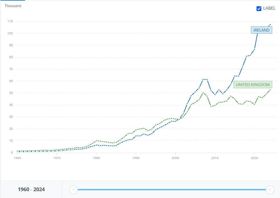
Average annual growth:
Ireland: 8.1%
UK: 5.1%5
The UK begins wealthier, but Ireland steadily gains, finally catching up and pulling ahead in 2000 - after which it just rockets away. Note in particular the dismal UK GDP per capita growth averages a pathetic 0.23% annual growth - truly a lost two decades.
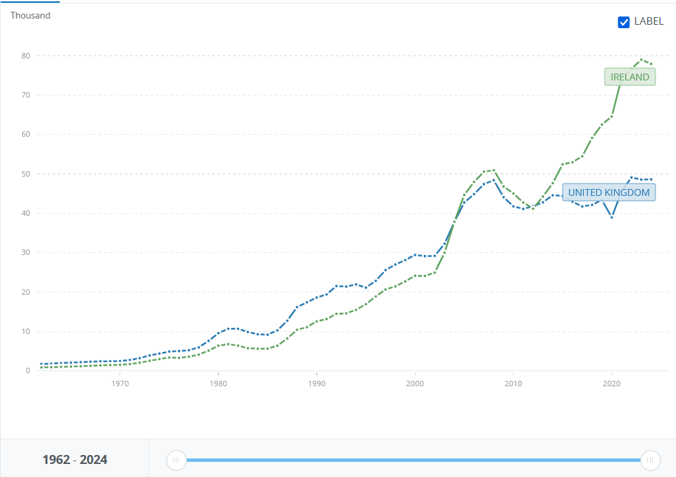
Now, Ireland’s GDP is considered unreliable as a measure at the moment, because a number of very large multinational companies book activity there for tax reasons. The graph below, therefore, shows GNI per capita, which we can see shows a similar story, with Ireland again catching up in the early noughties and then pulling away.
Result: Small country win.
Belgium and France
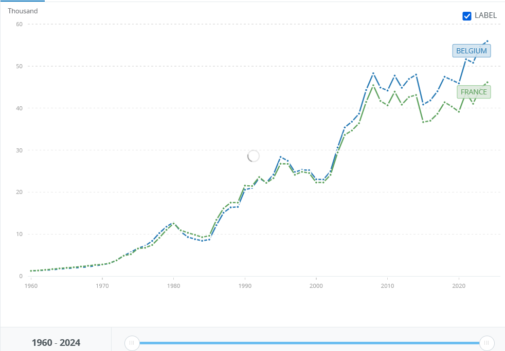
Average annual growth:
Belgium: 6.1%
France: 5.7%
Both countries have very similar trajectories, but Belgium very gradually overtakes and pulls ahead, with the advantage accelerating this century.
Result: Small country win
Ukraine, Belarus and Russia
This chart begins in 1991, when Ukraine and Belarus gained their independence, and ends in 2021, the year before Russia invaded Ukraine.
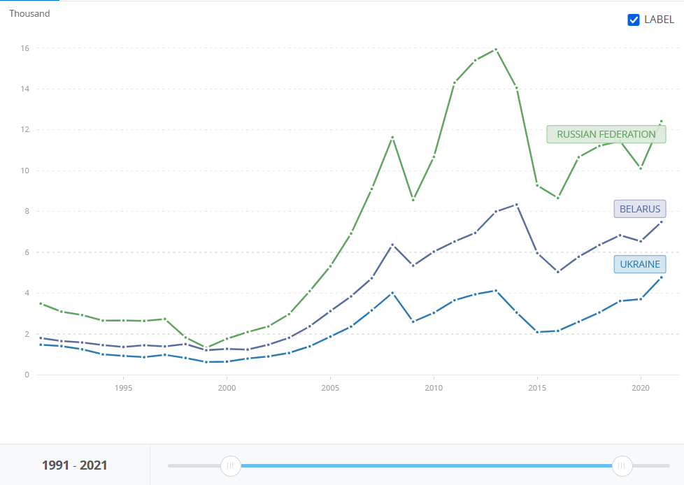
Average annual growth:
Ukraine: 3.3%
Belarus: 4.9%
Russia: 7.3%
The three countries started in the same rank order and ended in the same rank order: Russia first, then Belarus, then Ukraine.6 What’s even more interesting is that their average growth rates - while fluctuating a lot more than many of the other graphs we’ve seen - are also in that same rank order.7
Result: Large country win
Sri Lanka, Nepal and India
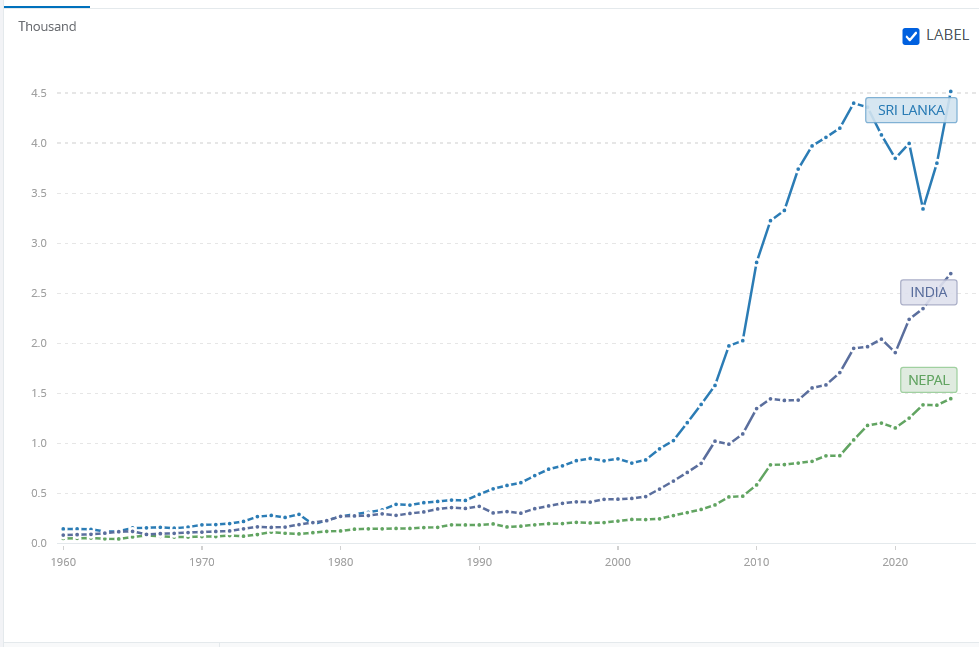
Average annual growth:
Sri Lanka: 5.5%
Nepal: 5.5%
India: 5.4%
As with our previous example, the three countries started in the same rank order and ended in the same rank order. This time, however, rather than the large country winning at both ends, India comes in the middle - with Sri Lanka consistently richer and Nepal consistently poorer. Perhaps even more interestingly, all three have almost identical growth rates, though Sri Lanka’s would look better if it hadn’t been for its recent economic crisis.8
Result: Winner unclear
So, what’s the upshot?

We have three cases of the large countries doing better economically, three of the small countries doing better economically and two where the winner is unclear. We don’t even have any obvious patterns such as ‘if the big country is a democracy/devloped country, the large country will do better.’
So are both of the arguments we began with wrong?
In fact, they are both partially right. There are advantages to being part of a larger market. There are also advantages to having the flexibility to being nimble, and able to shape one’s economic and regulatory policies for one’s specific circumstances.9
But the both of these effects are sufficiently small that they’re massively outweighed by a country’s domestic policies. There are countries that do worse than their larger neighbours - and countries that do better, even if that neighbour is a regional hegemon.
There are, of course, considerations that go beyond the economic. In the Canada-USA example, it is likely that Canada is poorer than it would have been had it merged with the United States. But Canada is still a very wealthy country - and most Canadians feel there are other, intangible, benefits to being independent, such as universal health care, better gun laws and not having Donald Trump as President.10
Throughout history, some of the most unlikely countries in the world, from Singapore to the Netherlands, have thriven. And while some large countries - from the United States, to China under Deng and his successors - have become superpowers, others have languished. More than we sometimes believe, every country has a powerful ability to set its own growth trajectory, for good or for ill.
Geography is not destiny.
Not least in the Brexit debate, though this is not primarily a post about Brexit.
These are the main examples I could think of. I omitted the Middle East (e.g. UAE and Saudi Arabia) because the answer will be dominated by oil revenues and don’t know enough about Africa or South America to know if there are good examples there.
This basically vanishes if you look at in PPP terms.
Astonishingly, it was actually richer than South Korea in 1960, which was a fact I hadn’t known before today.
The UK has not actually experiences an average GDP per capita growth period over this period. If we look at the 1960 - 1980 section, this data implies that GDP per capita grew at 10% annually on average over this period - which is certainly not the case. I suspect this is something to do with measuring everything in current dollars, and global exchange rates, and assume it impacts other countries too. I’d welcome anyone with more expertise sharing thoughts on this.
This really surprised me. I think of Belarus as a poorer and more dysfunctional country than Ukraine, so I was shocked to find out it was about 50% wealthier in terms of GPD per capita. It makes Ukraine’s performance on the battlefield even more remarkable.
To those who have, more shall be given…
It’s extraordinary that Sri Lanka’s lurch to organic farming is considerably more noticeable on a GPD per capita chart than its decades long civil war. Don’t listen to organic farming propagandists, kid - they’ll mess you up big time if you let them.
If one leaves a large market, and makes almost no effort to use that freedom to optimise one’s policies - as the UK has over Brexit - then there will be an economic cost.
Yet!
This is a bit of a cheeky comment but I wonder what the graphs would look like with a logarithmic scale? It’s difficult to see any separation between the countries for the first couple of decades and a log scale might show the starting points a little easier. Either way, fascinating analysis that I hadn’t ever thought about before.
very good